

Fall dressing with spring colours
Fall dressing with spring colours
Give me all the lavender, periwinkle, butter and sage

It’s officially September and the prolonged summer we were experiencing just a few days ago has promptly veen washed away by fall showers. It’s jacket weather. Sneaker or boot weather. Sweater weather, if you will.
A few of us are crying, already craving the return of heat and light and sweat running down your back on your morning commute. Others (read: me) finally feel like they got their wardrobe back and can truly stretch the limits of our style with fun layers and interesting yummy textures. (I won’t say it but it starts with an S and rhymes with blade). But as I’ve been scrolling Pinterest for fresh takes on fall style and catching up on all the inspo from my favourite writers here on Substack, I’ve felt kind of… lost. I’m not yet eager to paint my nails in burgundy, wrap myself in navy cashmere or pull out my wool pants to pair with knitted sweaters. Yes, I want to wear my s*ede jackets/bags, but no, I don’t want to dress in gemstone colours (emerald/ruby/etc).
The cure? Fall dressing with spring colours.
Okay, first of all — what are these “spring colours” you speak of? Well it’s partly colours I/you/we associate with spring, like pastels and lighter tones. As it so happens, these are also the colours that some of us have been prescribed due to our low-contrast warm-skintone looks (not to be confused with fair skin). I am probably not a so-called spring. But guess what? I don’t care! I can wear whatever colours I want!
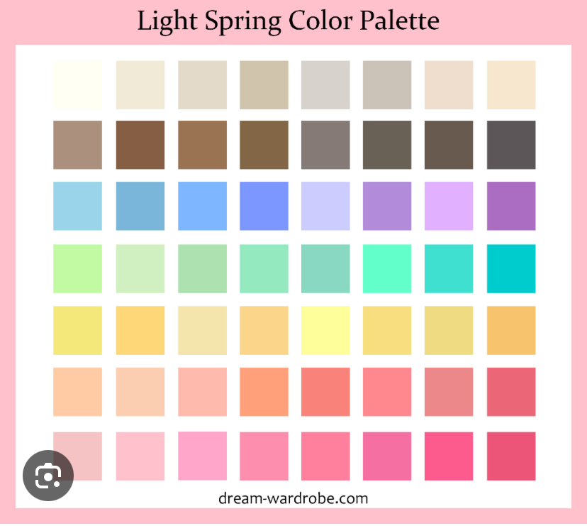
How exciting to be bringing out your butter yellows, sage greens, sky blues and peachy pinks while everyone else is dressed in head-to-toe black? Instant mood-boster. Not to toot my own horn but I feel like this is kind of genius. Maybe this way of dressing can even help lighten my seasonal depression? Okay, okay. (But like, maybe?)
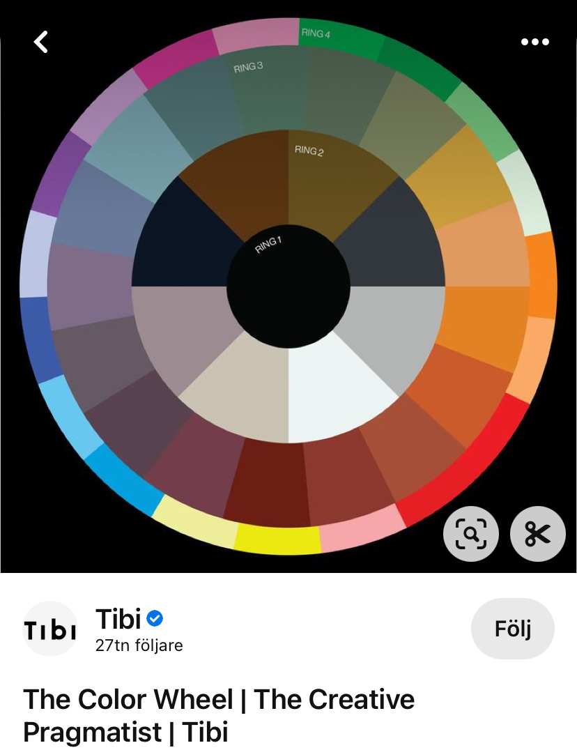
The other thing is, these colours look absolutely delicious paired with those true stereotypical autumn colours. Think of the Tibi wheel. I know it’s kind of a tired fashion trope at this point but it really works. Your classic ring 2 colours (navy, brown, taupe, and I would personally include burgundy) just feel *right* and *expensive* next to the ring 3 colours (greyish lavender, light mustard, dirty aqua, plum, olive, etc). And the non-Bauhaus colours from ring 4 (sky blue, lavender, butter yellow, peach, grass green) add a youthful (?) breath of fresh air.
If you’re still not convinced, allow me to demonstrate.
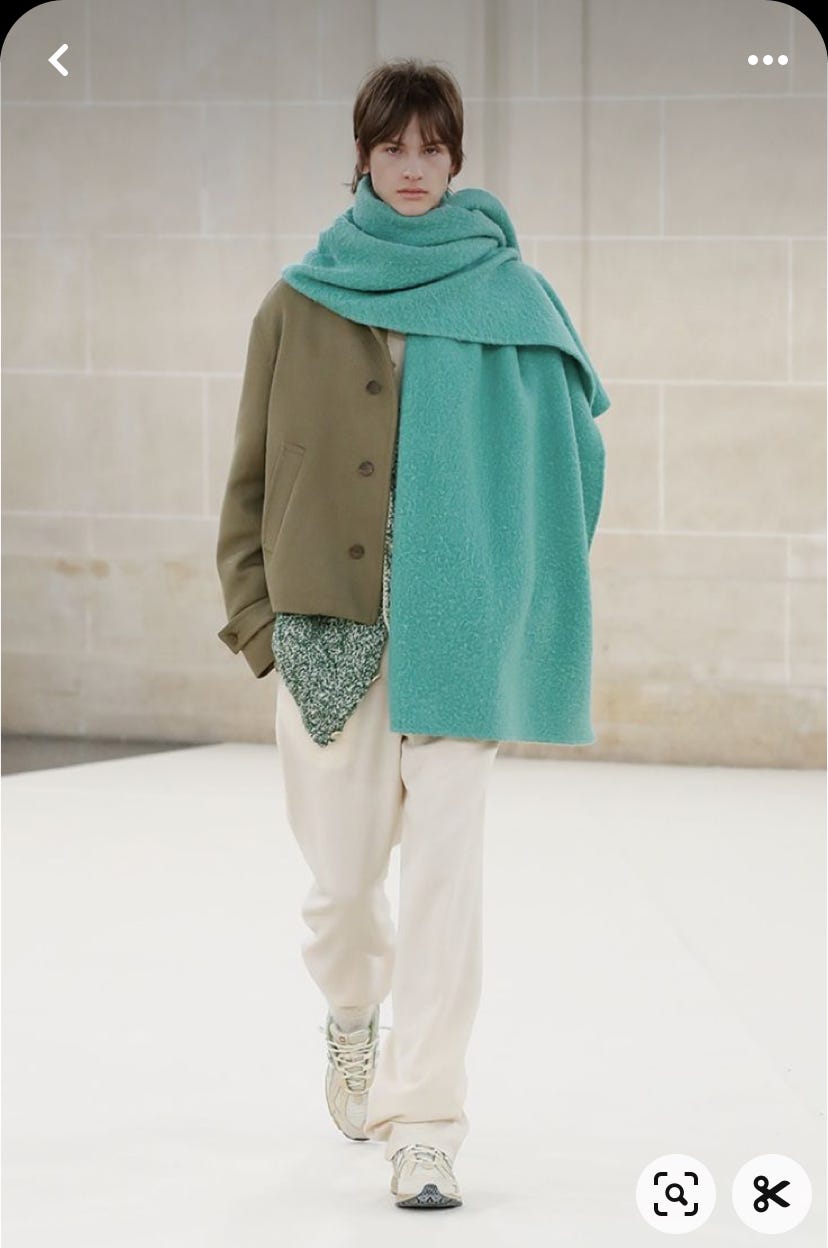
At this point I’ve definitely pulled out both my beloved field jacket as well as a few others from under my bed storage. My first instinct is to pair these slightly darker greens with… well more green, or darker denim. Maybe brown. But just look at the beauty of this creamy white and turquoise!
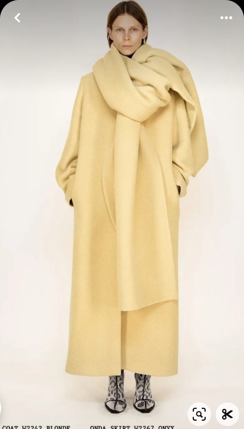
This is very straight up-and-down stick of butter. Spring butter. No notes.
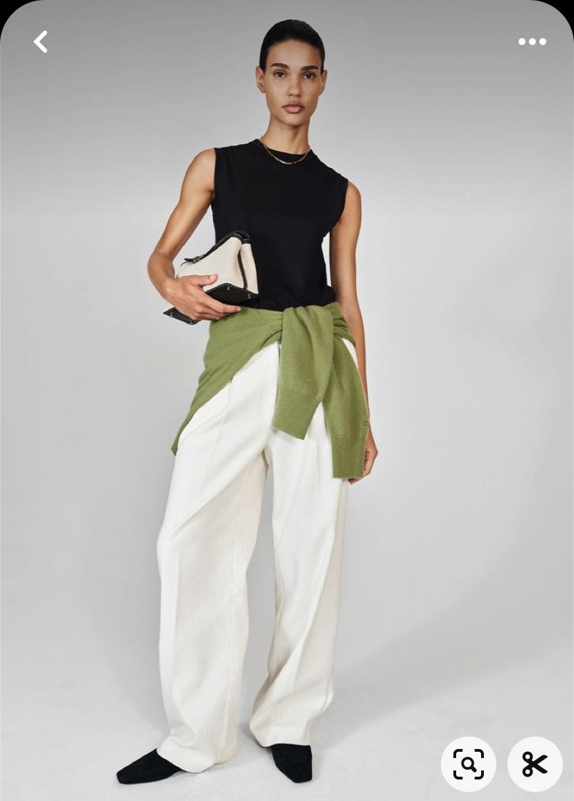
This might not be the most wearable pants for a rainy and wet day. But this is not a post about practicality! This is a post about yummy colour combos and you must admit that this apple green sweater elevates this black-and-white ensemble to the next level.
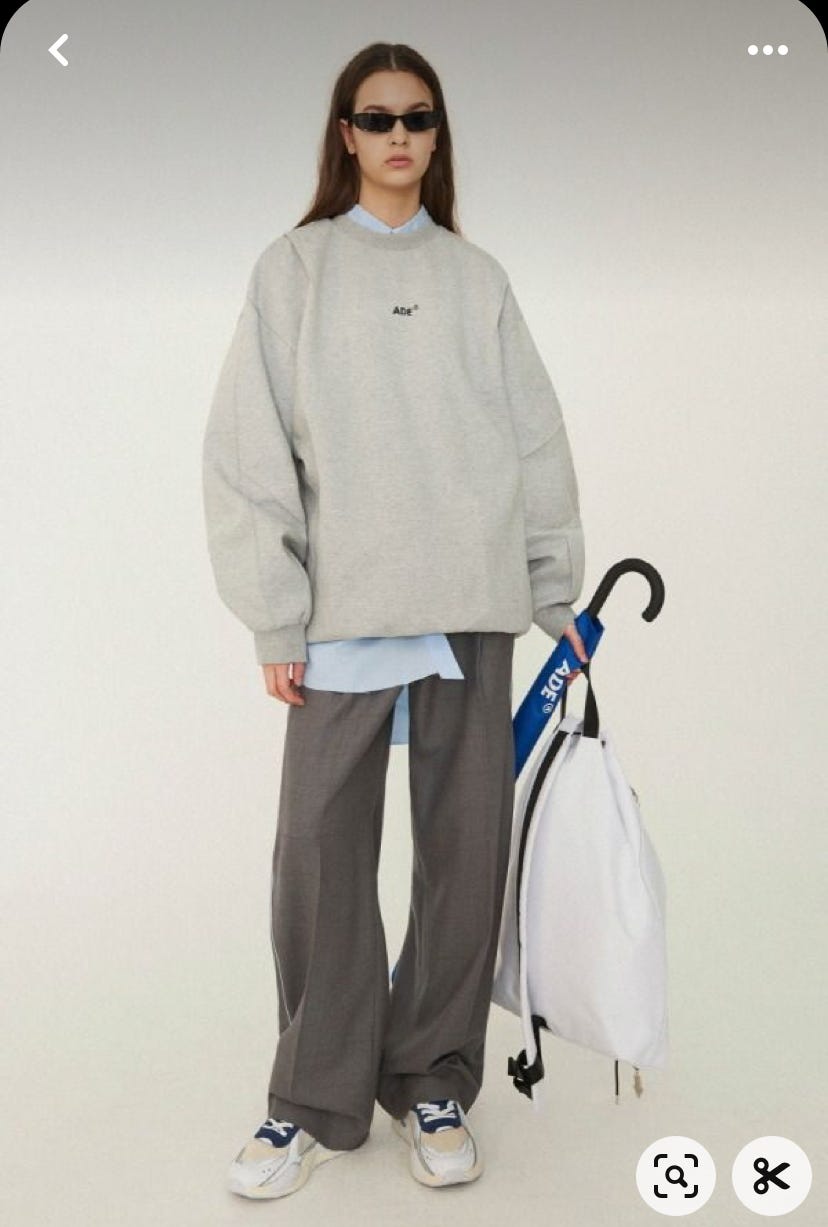
This outfit wouldn’t have been the same without the addition of a periwinkle shirt sticking out, elevating the gray out of its joyless confines.
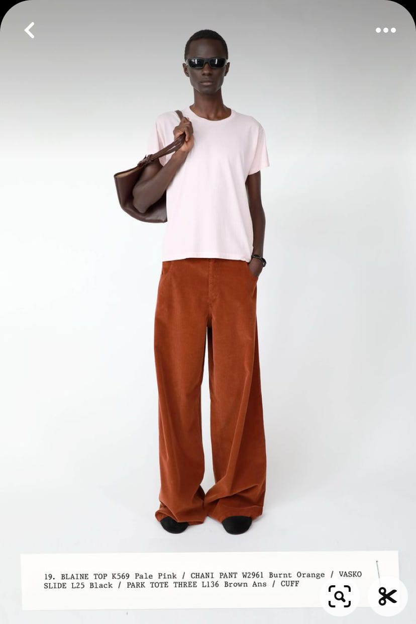
Brick red pants + chocolate brown leather bag + *tadaa* cotton candy tshirt. Just wouldn’t have been the same with a black/gray/white shirt. You can’t convince me otherwise.
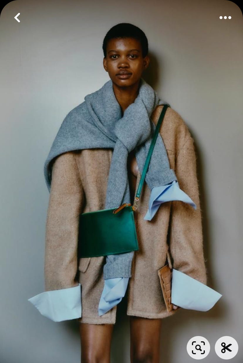
Okay — if I haven’t convinced you yet, just take a look at this. This is the cover image for my fall capsule wardrobe. The light camel wool blazer paired with baby blue, dusty gray and a touch of aqua emerald.
So… who’s with me?
Oooh this is good! I just read a post about dressing for the literal season with your color season in mind but I quite like this take on using an opposing color season for dressing for a literal season!
Plus, you know I’m a Tibi color freak 🤓
Oh, I’m definitely with you!! Amazingly lovely color combos 😍